
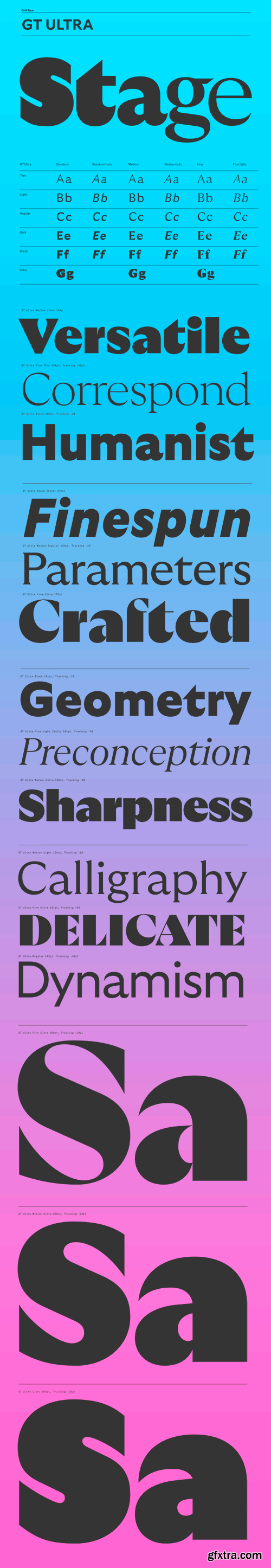
GT Ultra Font Family
GT Ultra dances between the worlds of sans and serifs, fusing calligraphy and construction. The versatile typographic system combines the centuries-old context of serif type with the dynamism of modern sans; challenging its own definition and questioning contemporary typographic expectation.
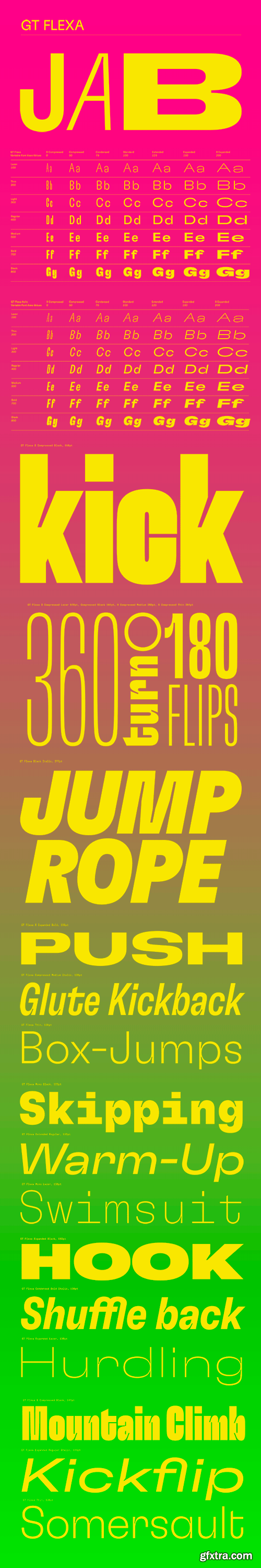
GT Flexa Font Family
Instead of the traditional view of a typeface as a collection of static styles, GT Flexa embraces the idea of a fluid design space. As a dynamic tool, it enables joyful typesetting that allows for fully responsive designs. The result is an impressively extensive typographic system with a distinctive personality.

GT Alpina Superfamily
GT Alpina proudly calls itself a workhorse serif, but delights in playing with the very meaning of that concept. It reaches into the grab bag of typographic history to resurrect shapes some may falsely see as too expressive, resulting in a meticulous family melding these distinct shapes with a pragmatic execution.
English | 132 pages | True PDF | 63.1 MB
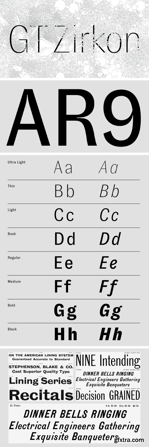
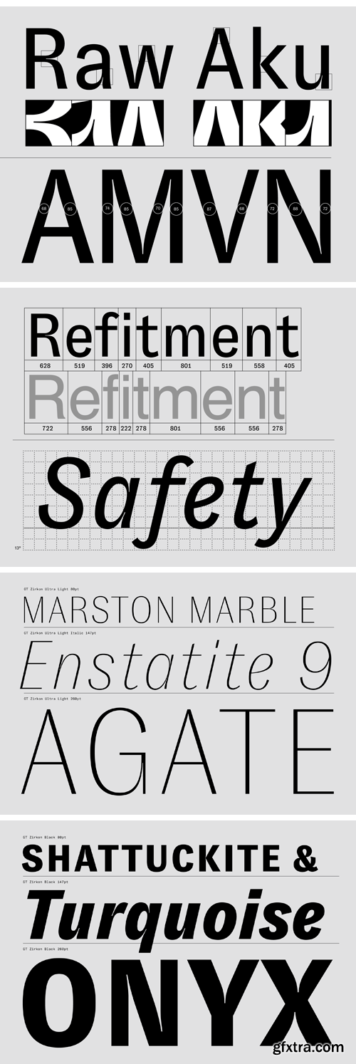
GT Zirkon Font Family
GT Zirkon freely mixes historical and contemporary ideas in this new sans serif design. Created by Tobias Rechsteiner over a nine year period, this typeface may sparkle like a gem stone — but we think of it more like a heavy-duty tool with exquisite utility. It unites aspects typically associated with typefaces optimized for body copy sizes with more exuberant details usually found in display type.


https://www.grillitype.com/typeface/gt-pressura
GT Pressura is inspired by metal type printing history as well as engineered letters stamped onto shipping boxes. It uses the visual gesture of ink spreading under pressure as a stylistic device, offering an alternative to more spindly typefaces of the digital age.


https://www.grillitype.com/typeface/gt-walsheim
Inspired by the lettering of Swiss poster designer legend Otto Baumberger from the 1930s, GT Walsheim is a friendly but precise typeface. Supports all Cyrillic languages.

https://www.grillitype.com/typeface/gt-cinetype
GT Cinetype is based on a design engineered for a cinema subtitling machine. By using a laser to erase the color layer of the film, very small and brilliantly white letters appear. The laser can only move in straight lines, so the typeface contains no curves.
SermonBox - Seasonal Collection

SermonBox - The Series Pack Collection

Top Rated News


Would you like to be a Author?


